Company
Boatsetter
Role
Lead Product Designer
I started by auditing other rental platform to gather and inform my perspective on best practices
From the audit we were able to see the areas which needs most improvement and had the biggest accessibility issues, and note which areas were of the most importance to be updated.
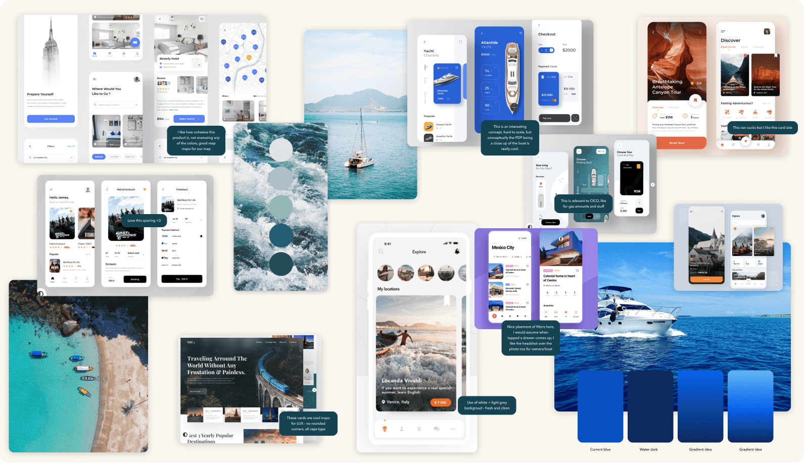
I took a beat to gather visual and motion inspiration, knowing we had an opportunity to really improve the UI
Before making any structural or visual decisions, I explored patterns, color approaches, and imagery from best-in-class products. This gave me a clear understanding of where we could push, what we should rethink, and how to establish a cohesive system from day one.
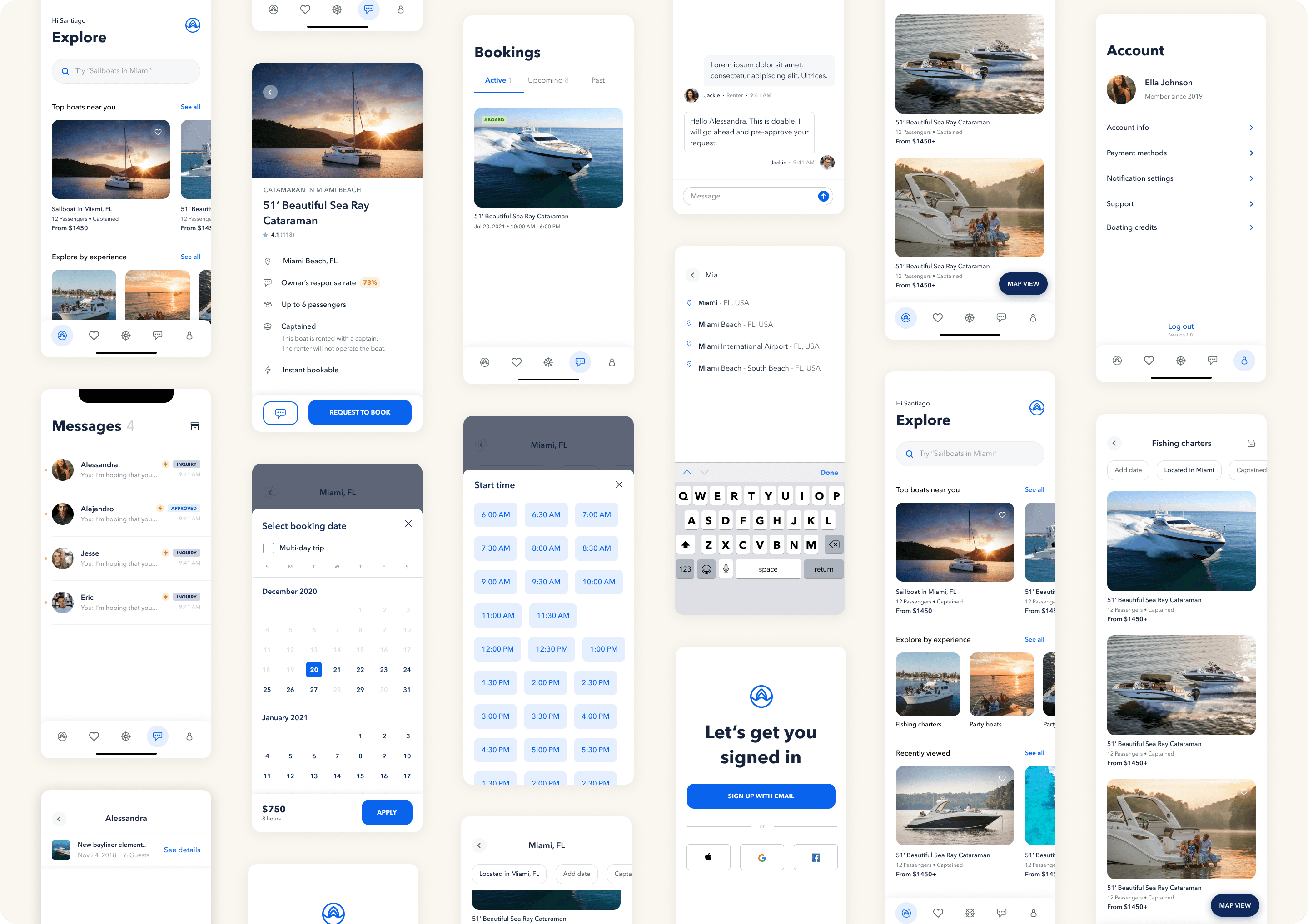
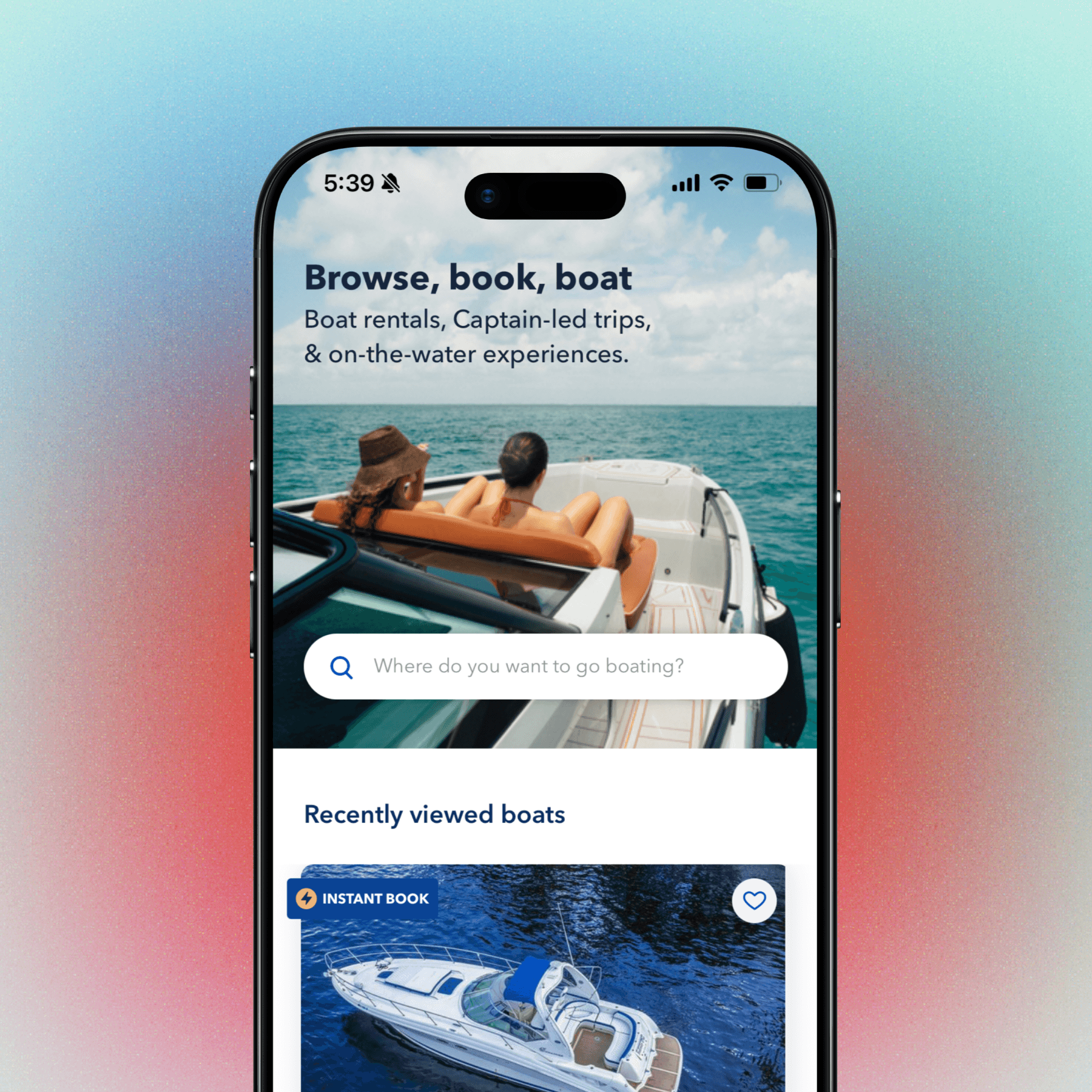
Once we had alignment on a direction, I designed the full rental app experience
Once our core concept was locked in, I shifted into designing the full end-to-end product experience. I led several key areas of the app—building the sections where users could track upcoming bookings, communicate with their captain and crew, manage cancellations, and view or update their account details.
This phase brought the concept to life by ensuring every part of the journey felt cohesive, intuitive, and trustworthy.
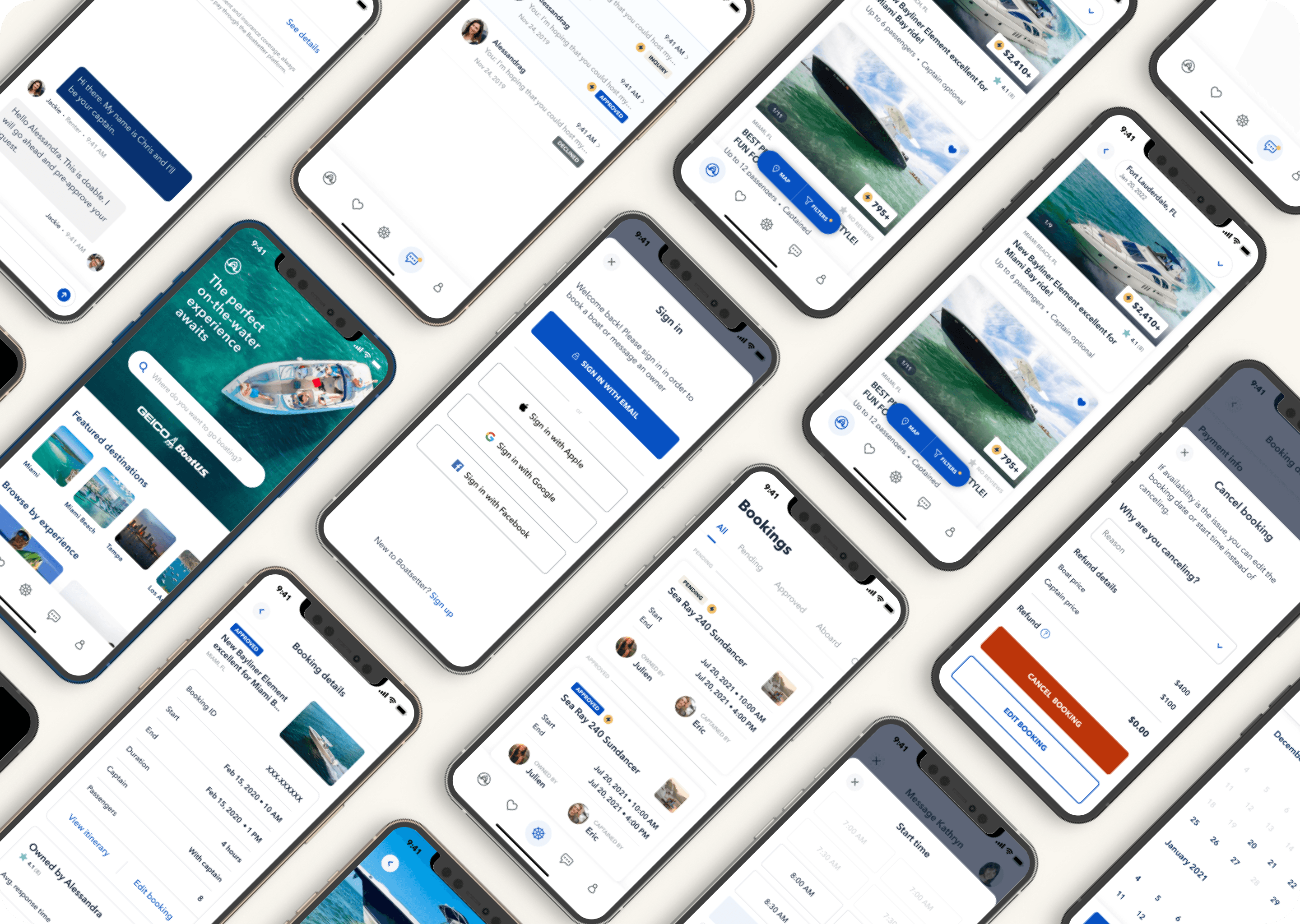
Feature highlight: Redesigning the booking experience for more seamless management, changes or cancellations
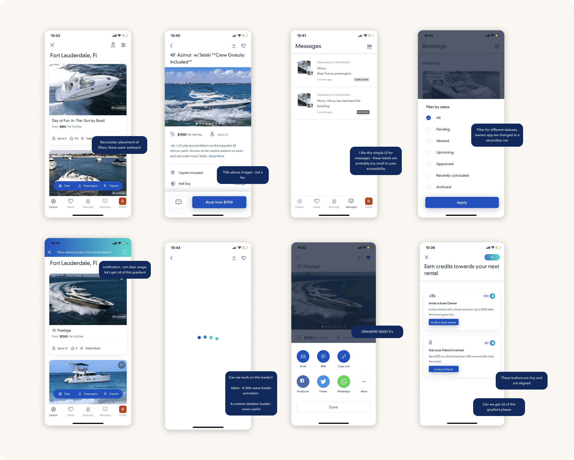
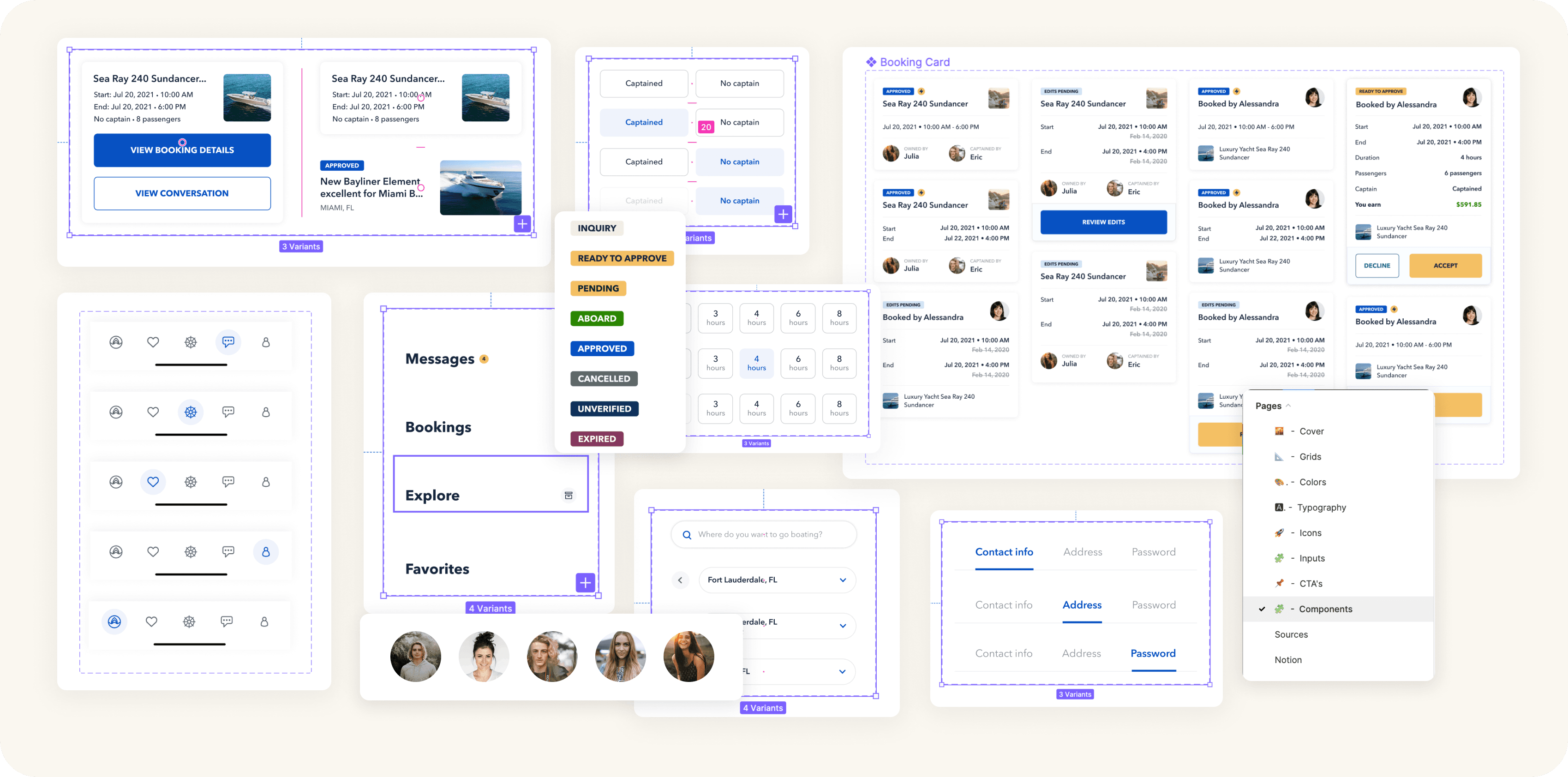
One large area of focus was the experience for boat bookings — the hub where users can see, manage, edit or change any boating trips. This space needed to feel organized, intuitive, and reliable, especially when users were making time-sensitive changes to their plans.
Key areas of focus included:
Creating a streamlined Edit Trip flow
Improving the content hierarchy for faster scanning
Introducing a clear “edit pending” status
Designing a more intuitive Cancel Booking experience
Repositioning key actions to reduce friction
Redefining and reorganizing booking labels for clarity
Ensuring accuracy in our developer handoff
One of my favorite parts of working at Boatsetter was our commitment to precise, intentional handoff. We created a dedicated Redlines page in our final Figma file, documenting every spacing rule, typography choice, and micro-interaction. This served as a single source of truth for engineers—ensuring that when questions came up or we entered Design QA, every detail was clearly defined and easy to reference.
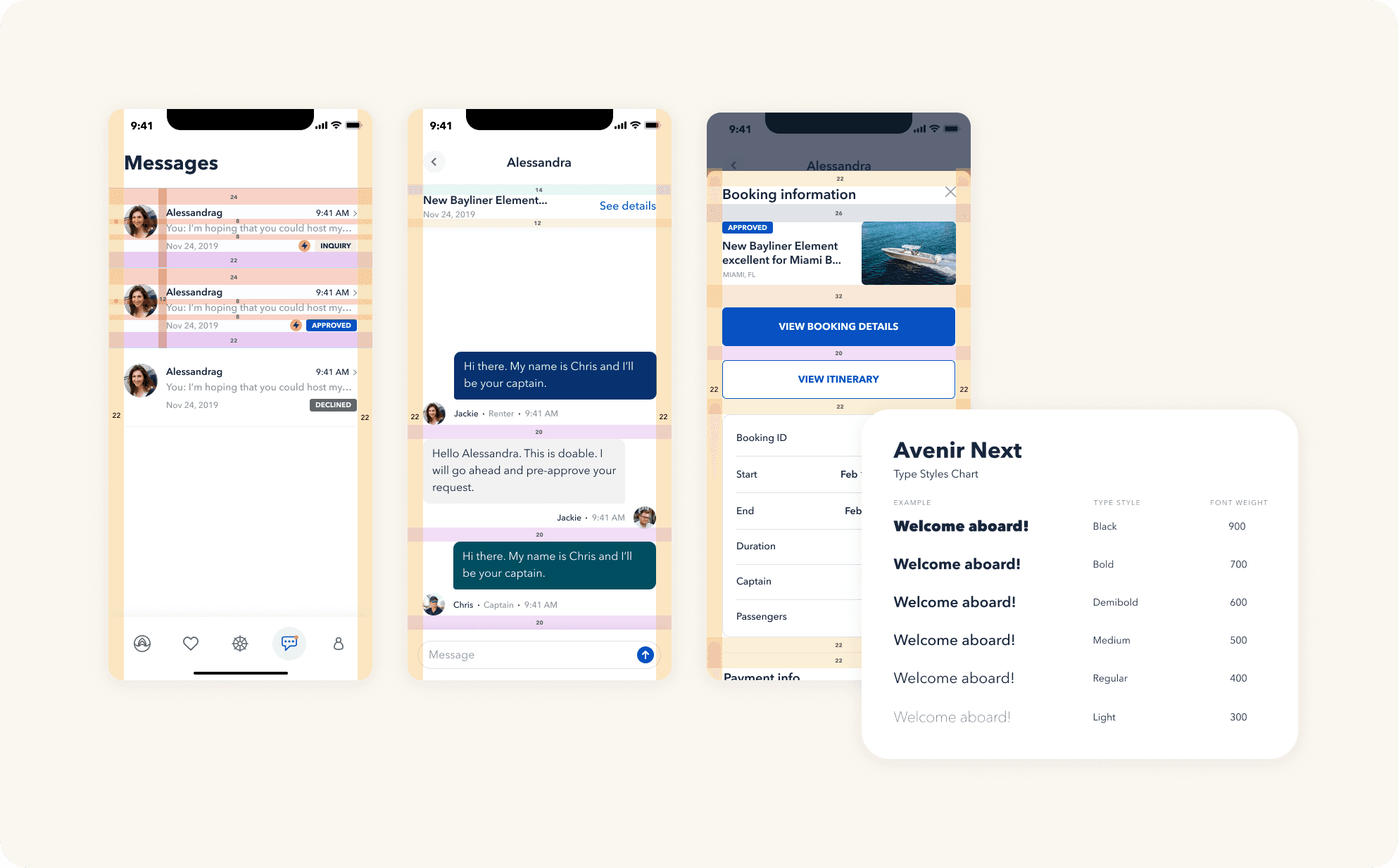
And, true to start-up culture, I completed this project by making updates and additions of new components to our design system
Like most startup teams, we all wore a lot of hats—and one of mine was owning our Figma component library. As we wrapped up the project, I built and documented all of the new components, updated our design system guidelines, and made sure everything was polished and ready for the team. I designed, tested, and refined each component before publishing it to the shared library, then shared it out to our tiny-but-mighty design team so they could use the new components too.
The Boatsetter Rental app relaunched right on time—before the summer high season.
Delivering on time ensured the redesigned experience could drive impact during the season when bookings spike.